iOS 8 and Translucent Input Views
As we know the visual style of Apple's mobile OS changed significantly with the introduction of iOS 7, and like most developers the team and I at Armchair Engineering made a concerted effort to update our applications to reflect this new direction. Many of our apps make use of custom input views to provide a nicer numerical keyboard than the default offering, to refresh these we decided to make the number pad partially transparent, taking the lead of the standard system keyboard.
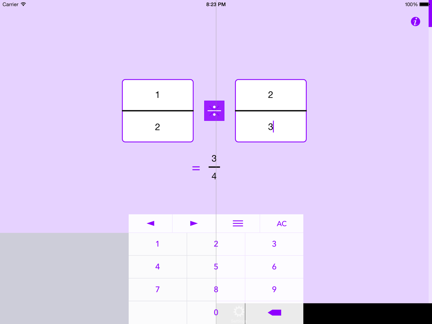
Both UITextField and UITextView have supported custom input views since iOS 3.2 and implementing them is really dead simple, even with a translucent background. That was until iOS 8 came along, which for whatever reason introduced a solid grey view underneath all custom input views and, as you can see from the screenshot below, completely ruined the semi-transparent effect we were going for.

Fraction Help screenshot - Before (left) and after fix (right)
The first solution we tried was to walk through the view hierarchy, find and alter the opacity of the offending view (UIKBInputBackdropView). While this approach does work, the keyboard is redrawn every time it appears and we often saw a short glimpse of grey each time before being able to hide that pesky backing view, which looked a little too sloppy for us to persist with long.
Both UITextField and UITextView also have an inputAccessoryView property, which is used to place an additional view atop of the keyboard to augment and provide additional functionality. We were already using this to provide a quick way for the user to jump back and forth between the text fields and for the clear all function (also visible in the image above). Unlike good ol' inputView this accessory view was never gifted a grey backdrop with iOS 8. As such the easiest solution turned out to be to just use this for the whole keyboard, and set an empty UIView of size zero as the inputView, bypassing it altogether.
